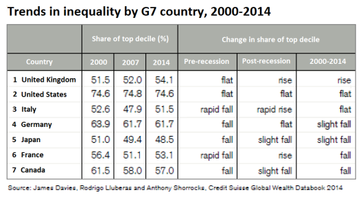
Here’s a useful table which shows how inequality has changed in the G7 countries since 2000.
It uses the % wealth share of the top 10% (decile) of the population:

And before anybody accuses me of peddling ‘left-wing’ propaganda – the data was compiled by that well-known hotbed of socialist thinking Credit Suisse.